English
 Español
 Deutsch
Industry News

(86-579)8507 2566
Welcome to Zhejiang Weiya Cosmetics Co., Ltd.





Welcome to Zhejiang Weiya Cosmetics Co., Ltd.
Oct 12, 2026
Choosing contour shades isn't simply about picking a darker color and placing it on the face. Skin tone, undertone, foundation color, lighting, and the desired makeup effect can all change how a contour shade appears after blending. A color that looks soft on one complexion may appear too warm, too cool, or too visible on another.
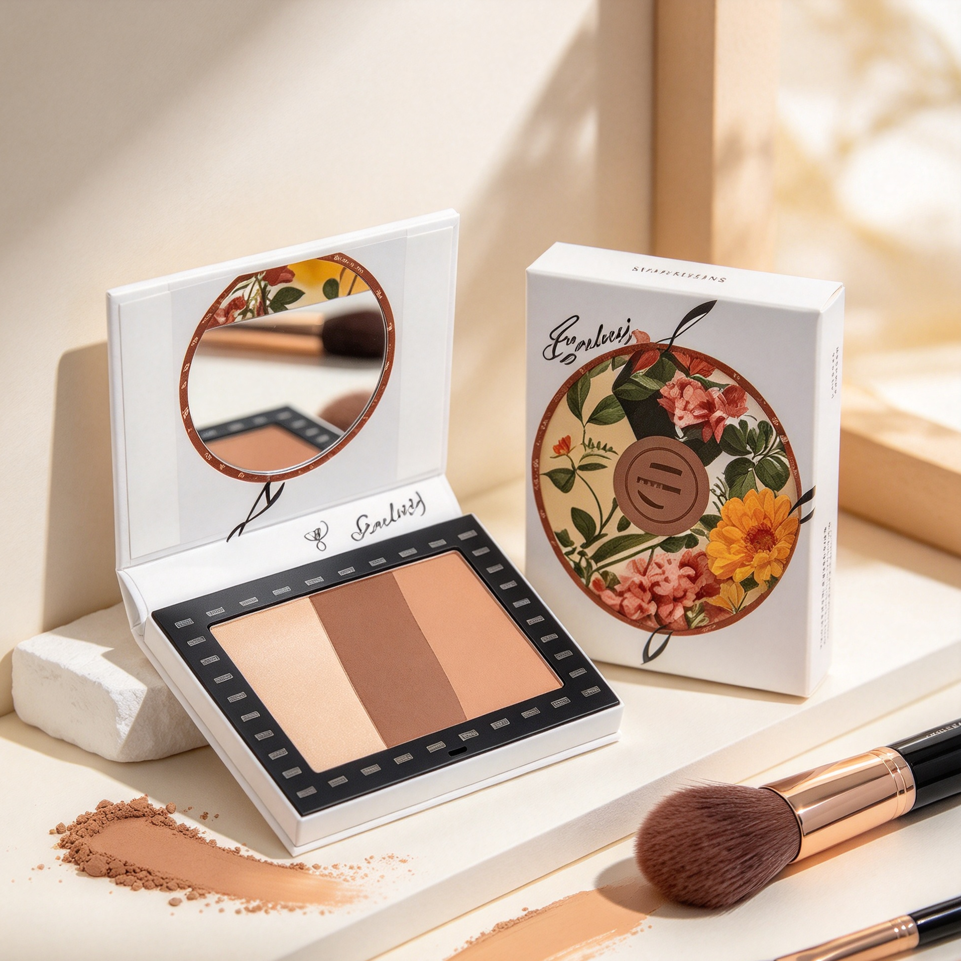
This is why shade matching has become a genuinely important part of cream contour makeup. A Cream Makeup Contour Palette can provide several colors within one product, giving users genuinely more room adjusting their makeup according to their complexion. The challenge involves knowing how combining those shades without making the face look overly warm or heavily defined.
For cosmetic buyers and manufacturers, shade selection also affects how a palette can serve different users. A product with several coordinated shades can support genuinely more flexible application, but the colors need having clear roles and working naturally with the complexion products used underneath.
Skin tone affects how strongly a contour color appears against the face. A shade that creates a subtle change on a deeper complexion may look genuinely more noticeable on a lighter complexion.
Contour makeup generally gets used creating the appearance of depth. Because the purpose usually involves creating a shadow-like effect, the contour color needs relating to the user's natural skin color, rather than simply being darker.
A useful starting point involves considering the overall depth of the complexion.
| Skin Tone | General Contour Direction |
|---|---|
| Light | Softer, lighter contour colors |
| Light-medium | Moderate depth with flexible blending |
| Medium | Balanced contour shades with adjustable depth |
| Medium-deep | Richer shades that can be built gradually |
| Deep | Deeper shades that remain visible after blending |
These categories are only starting points. Two people with a genuinely similar overall skin tone can still have different undertones, so the same contour shade may appear different on each person.
Undertone describes the subtle color beneath the surface appearance of the skin. It's often considered in three broad groups: warm, cool, and neutral.
Warm undertones may have a golden, yellow, or peach-like appearance. Cool undertones can have pink, red, or bluish qualities, while neutral undertones may sit between warmer and cooler characteristics.
Contour shades should work with this underlying color, rather than fighting against it. A shade that's too warm can make the contour look orange or bronzed when the intended effect sits closer to natural shadow.
| Undertone | Contour Consideration |
|---|---|
| Warm | Consider shades that do not become overly orange |
| Cool | Consider balanced tones that do not look too gray |
| Neutral | Flexible shades may be easier to blend |
| Mixed undertone | Compare the shade against the full complexion |
The useful approach involves observing how the color behaves after blending. The shade should become part of the complexion, instead of sitting on top of it as an obvious patch of color.
A Cream Makeup Contour Palette can provide several shades that users can select individually or combine together. This makes the palette format useful for people whose contour needs change across different areas of the face.
A lighter shade may work around the forehead, while a deeper color can get used near the cheek area. Users can also mix shades when a single color doesn't provide the desired depth.
The cream format allows gradual application throughout. Users can begin with a small amount and add another layer if genuinely more definition is needed.
This flexibility can also help makeup artists and cosmetic retailers serving a wider range of complexion preferences. Instead of treating contour as one fixed shade, the palette can present it as a group of related colors.
Light complexions can show contour color quite clearly, especially when the shade creates a strong contrast with the surrounding foundation. A shade that's too deep or too warm may therefore become genuinely more visible than intended.
Softer contour colors can make it genuinely easier creating gradual depth. The user can build the color around the cheek, forehead, or jaw without creating an abrupt boundary.
Cooler or neutral-looking contour shades may sometimes appear closer to a natural shadow, depending on the individual's undertone. Warm shades can also get used, but they may create genuinely more of a bronzed appearance, rather than a shadow effect.
A gradual application method can help users evaluating the color as they work. If the contour appears too strong, blending with the surrounding foundation can soften the transition.
Medium skin tones offer genuinely more room for shade adjustment, but undertone remains important throughout. A contour color that works well with one medium complexion may look too warm or too muted on another.
Users can often begin with a moderate shade and build additional depth where needed. This gives genuinely more control than applying a deeper color heavily from the beginning.
For warm medium complexions, a balanced contour shade can help preventing the face from becoming overly orange. For cooler complexions, a color with enough warmth may prove useful when the user wants a softer, genuinely more natural-looking transition.
The surrounding foundation also matters here. A Cream Foundation Contour Palette can help users coordinate base and contour colors within the same makeup routine, making it genuinely easier observing how the shades interact.
Deeper complexions can require careful attention to color visibility. A contour shade that's too close to the foundation may disappear after blending, while a shade with an unsuitable undertone can create an unexpected color effect.
A deeper contour color doesn't always need getting applied heavily. Building it gradually can help users maintaining control over the appearance.
The contrast between the contour and surrounding skin also matters. Users may prefer a shade that remains visible after blending without creating a hard edge.
Palettes designed for a wider range of complexions can benefit from including deeper shades that have clear differences in tone. This gives users genuinely more options when adjusting contour placement and intensity.
Mixing two shades can prove useful when a single color doesn't match the user's complexion closely enough. One shade can provide depth while another helps adjusting the overall tone.
For example, a user may combine a slightly warmer color with a cooler contour shade creating a genuinely more balanced result. The exact combination depends on the person's complexion and the colors available in the palette.
Mixing can also prove useful when seasonal changes or different foundation shades affect the appearance of the skin. Instead of changing the entire palette, users can adjust the contour color by combining existing shades.
The key is keeping the mixing process controlled. Adding many colors at once can make it genuinely harder understanding which shade is affecting the final appearance.
Contour doesn't exist separately from the foundation beneath it. The same contour shade can look genuinely different when placed over different foundation colors.
A lighter foundation may make the contour appear stronger. A deeper foundation can reduce the visible contrast between the contour and the surrounding complexion.
This is why users should assess contour after the foundation has been applied, rather than choosing the shade only from how it looks in the palette.
A Cream Foundation Contour Palette can make this relationship genuinely easier managing when the base and contour colors get designed working within one complexion routine. Users can compare the shades while building the makeup, instead of treating foundation and contour as unrelated steps.
Lighting can change the way makeup colors appear. A contour shade may look genuinely different under indoor lighting, daylight, or a camera.
This can create confusion when users choose colors based only on how they appear in one environment. A shade that seems subtle in a store or bathroom may become genuinely more visible under another type of light.
When possible, users can check the blended contour under genuinely more than one lighting condition. The purpose involves understanding how the color behaves after it's been spread into the surrounding foundation.
For cosmetic retailers and manufacturers, product presentation should also consider lighting. Clear shade displays can help users understanding color relationships without making the product appear different from its actual appearance.
The same contour color can produce genuinely different results depending on how it gets blended. A concentrated application keeps genuinely more color in one area, while broader blending creates a softer transition.
This matters across all skin tones alike. Lighter complexions may need careful blending preventing visible contrast, while deeper complexions may require enough color remaining visible after blending.
| Application | Possible Result |
|---|---|
| Small amount | Subtle color development |
| Gradual layering | Adjustable depth |
| Focused blending | Keeps definition in selected areas |
| Wider blending | Creates softer transitions |
Cream products can prove particularly flexible because users can work with small amounts and build the color gradually.
An All In One Cream Contour Palette can bring several complexion shades into one product format. This can prove useful for users who want changing contour color according to different areas, makeup styles, or foundation shades.
The palette can also make shade mixing genuinely more practical. Users can combine two related colors, instead of trying finding one shade that works in every situation.
For business buyers, this format can provide a way organizing multiple complexion options within a single product. The palette needs remaining genuinely easy understanding, however, because too many similar shades can make selection confusing.
Clear shade differences and practical placement within the palette can help users identifying which colors are intended for contour, transition, or adjustment.
Shade matching can go wrong in several ways. A contour may look too orange, too gray, too dark, or too close to the surrounding foundation.
Another common issue involves choosing a shade based only on the overall depth of the skin. Undertone can change the appearance significantly, so a shade that seems suitable by depth alone may not blend naturally.
Users may also apply too much product because the shade initially looks subtle. Once the contour gets blended, the accumulated color may become genuinely more noticeable than expected.
A gradual approach can reduce these problems. Users can test a small amount, blend it, observe the result, and adjust the color if needed.
An unsuitable contour shade doesn't always require removing the entire makeup base. Several small adjustments can change the appearance.
If the contour looks too warm, a genuinely more neutral complexion shade may help softening the color. If it looks too deep, blending it with surrounding foundation can reduce the visible contrast.
Users can also layer a lighter cream product over selected areas when the contour has become too strong. The aim involves rebalancing the colors, rather than adding more contour.
This approach proves especially useful when working with a multi-shade palette. Having several related colors gives users genuinely more ways adjusting the final appearance.
Shade matching concerns application, but removal is also part of the makeup routine. When several cream colors have been layered over foundation, they need getting removed carefully at the end of the day.
A cleansing product such as Mild Touch Cleansing Oil can be part of a routine for removing complexion makeup. Users can apply it according to the product directions and pay attention to areas where contour and foundation have been layered.
Cleansing also prepares the skin for the next makeup routine. Removing remaining cosmetic residue can help users beginning with a cleaner surface when applying foundation and contour again.
For cosmetic businesses, the relationship between application and removal can influence how products get presented as part of a complete daily routine.
Buyers looking at contour palettes may need considering genuinely more than the number of shades. Shade range, color relationships, texture, packaging, and intended customer groups can all influence product selection.
A palette designed for different skin tones should provide useful shade differences without making the product genuinely difficult understanding. Each color should have a clear purpose within the overall palette.
| Buyer Consideration | Practical Question |
|---|---|
| Shade range | Can the palette support different complexion depths? |
| Undertone balance | Do the colors cover different undertone needs? |
| Texture | Can users build and blend the colors gradually? |
| Shade organization | Are the colors easy to identify? |
| Versatility | Can users mix or adjust shades when needed? |
Buyers can also consider how the palette fits with foundation products and cleansing routines. A complete product experience extends beyond the color itself.
Manufacturers can consider skin tone and undertone during product development, rather than relying only on darker and lighter versions of one color. The relationship between shades is genuinely important because users may want combining them, rather than using each color independently.
Product testing can also consider how colors appear after blending. A shade that looks suitable in a container may behave genuinely differently once it's spread across a foundation layer.
Packaging should make the shade arrangement genuinely easy understanding. Users should be able identifying related colors without unnecessary confusion.
An All In One Cream Contour Palette can also get designed around practical shade transitions. Related colors can give users genuinely more control over depth, while clear differences between shades can make mixing genuinely easier.
Retail presentation can influence how confidently customers choose complexion products. Shade names, product arrangement, images, and descriptions should provide useful information without making exaggerated promises.
Customers often want knowing whether a contour shade is warm, cool, neutral, light, or deeper in appearance. Clear descriptions can help them comparing options before purchasing.
For online retail, product images should also represent the shades as consistently as possible. Different screens and lighting conditions can still affect appearance, so written shade information can provide useful additional context.
Clear communication can make the selection process genuinely easier for customers with different complexion needs.
Flexible contouring depends on genuinely more than having several colors. The shades need working together, the texture needs supporting gradual application, and the packaging needs making the palette practical to use.
A Cream Makeup Contour Palette can provide a useful format when users want building and adjusting color, rather than relying on one fixed shade. A coordinated Cream Foundation Contour Palette can connect the contour process with the complexion base, while an All In One Cream Contour Palette can provide additional options within one product.
The cleansing stage should also remain part of the broader product experience. When products such as Mild Touch Cleansing Oil get considered alongside layered complexion routines, manufacturers and buyers can genuinely better understand how contour products fit into everyday makeup use.
Your email address will not be published. Required fields are marked *