English
 Español
 Deutsch
Industry News
Home / Blogs / Industry News / Why an Eyeshadow Blush Contour Palette Makes Makeup Coordination Easier

Welcome to Zhejiang Weiya Cosmetics Co., Ltd.

Jun 22, 2026
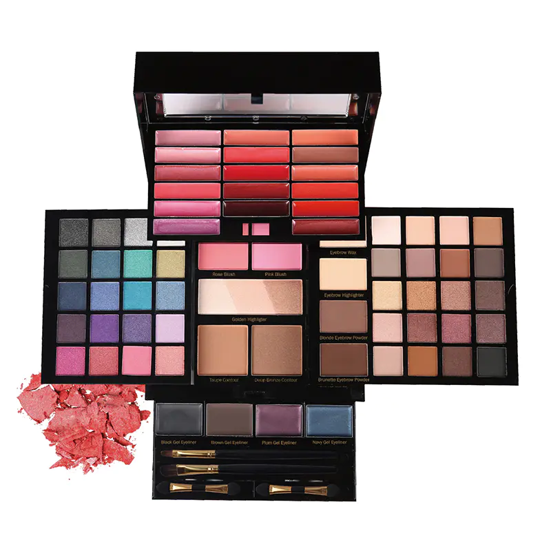
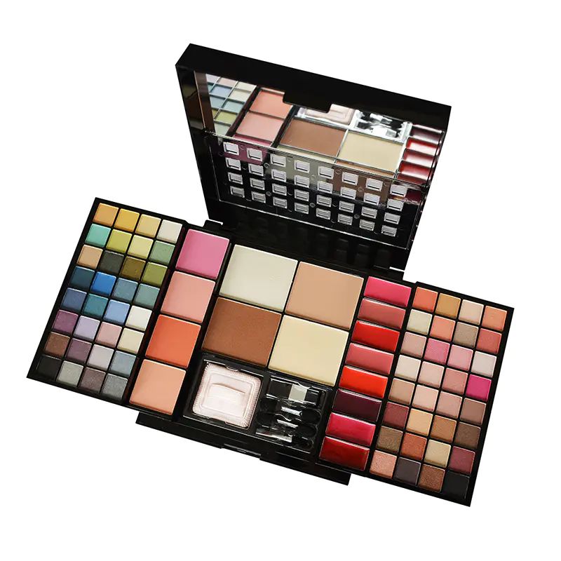
Makeup palettes mixing eyeshadow, blush, and contour have been getting more attention lately. A lot of people like grabbing one case that covers most of what they need for a full face instead of hunting down separate items. These sets make matching colors less of a headache. Brands have noticed shoppers want things that feel complete and actually useful for regular days or when they want to step it up a bit. The way the shades and textures play together often turns a rushed routine into something that looks more put together without extra effort.
When eyeshadow, blush, and contour shades come from the same palette they usually support each other instead of looking random. Tones that share similar undertones make the whole face hang together better. Moving from eyes to cheeks feels smoother and less jarring. This kind of setup helps stop that patchy disconnected look that happens when you mix and match from different brands or old purchases sitting in your drawer.
Using colors that were designed to work as a group takes some stress out of the process. You don' t spend forever wondering if the blush will fight with the eyeshadow. The end result just looks calmer and more intentional. Plenty of folks end up reaching for the palette more often because they know it will probably turn out okay without much fiddling.
Decent palettes think about how color moves from one part of the face to another. Soft blending between eye makeup and cheek color keeps things from having harsh edges. The face ends up looking more connected overall. This really shows when you go from indoor light to outside or move around during the day.
Coordinated palettes cut down on all the little decisions that slow you down. Everything you need is already sorted. The whole thing feels less like work and more like something you can actually enjoy doing. Many people say they feel more confident in how it turns out because the pieces were meant to go together from the start.
Lots of palettes stick with gentle neutrals and easy tones that work fine for normal days. They add a bit of definition without going overboard. These are great for office hours, running errands, or grabbing coffee with friends when you want to look awake but not like you tried too hard.
Some palettes have shades that start off light for daytime and can be built up later if plans change. A quick light layer in the morning can turn into something with more presence after work. That kind of flexibility means one palette handles more of your actual life without needing backup products.
You can start light and add more in spots where you want extra shape. Staying within the same color family keeps everything looking like it belongs. The look gains interest gradually instead of jumping straight to dramatic.
Good palettes usually mix a few current shades with classics that always work. This keeps the collection useful for longer instead of going out of style fast. You get room to try something new while still having safe choices for days when you just want to get it done.
When the feel of the products matches across the whole palette, blending goes much smoother. Eyes, cheeks, and contour areas connect better instead of feeling like separate layers. Inconsistent textures can leave weird patches or make the whole application take longer than it should.
Products that spread easily and blend without fighting tend to get picked up regularly. Good blendability lets you fix things on the spot if needed. The finished face looks more polished and less like you spent half an hour trying to make it work.
Starting with thin layers and adding as you go gives real control. This works for beginners and more experienced users alike. It cuts down on mistakes and helps you hit the right intensity without going too far by accident.
Matching textures make the entire face look like one smooth application. Nothing jumps out in a bad way. The makeup settles more naturally and tends to wear evenly as the day goes on.
People like when the hard work of matching has already been done for them. It saves time and lowers the chance of ending up with colors that don' t belong together. These ready palettes feel helpful instead of overwhelming.
Users want easy options but still like being able to play around a little. Palettes that give structure while leaving space for personal touches usually hit the right balance.
Palettes that move easily from morning meetings to evening plans get used more. That versatility makes the purchase feel like money well spent.
What people see and share online definitely affects what gets made. Palettes pick up on those ideas but still focus on actually working on skin. Nice visuals matter, but real performance through the day matters more for repeat use.
Clear placement of shades helps you grab what you need fast. Logical arrangement stops you from wasting time during rushed mornings. Good organization makes the whole palette feel easier to live with.
Easy to see differences between tones helps you choose better. Grouping related shades together feels natural. That small detail improves the experience every time you open it.
The outside should catch the eye but also protect the product properly. Cases that open smoothly and hold up over time win points. Design that matches the palette idea adds to the first impression without getting in the way of function.
Pretty packaging draws you in, but everyday practicality keeps you using it. Strong hinges, useful mirrors, and a size that actually fits in bags make a big difference in real life.
| Palette Element | Key Considerations | Everyday Advantages |
|---|---|---|
| Color Coordination | Complementary tones and transitions | More balanced natural looks |
| Texture Consistency | Similar feel across products | Easier blending and wear |
| Shade Variety | Mix of neutrals and accents | Flexibility for different days |
| Packaging Layout | Clear organization and durability | Quicker application and portability |
Palettes can quietly show part of what a brand is about just through the shades they pick. When the colors feel connected to the brand vibe, the whole collection hangs together better. Keeping that same feeling across different palettes helps people recognize the brand easier over time.
Not everyone wants the same thing from a palette. Some folks like soft and simple shades for everyday use, while others want more options to play around with. Brands that notice these differences and adjust their lines usually reach more people in the end.
Small changes here and there to match shifting tastes help palettes stay useful. The smart move is staying practical instead of jumping on every single new trend that pops up. This way the palette doesn' t feel outdated too fast.
When a palette works decently day after day, people tend to keep coming back to it. Good performance and practical design turn someone who buys once into someone who buys again. That steady use is what really helps a brand build strength over time.
Eyeshadow Blush Contour Palette collections keep catching attention because they make makeup feel easier and more reliable. When colors work well together, textures feel similar, and the design is practical, people actually use them. Brands that pay attention to these things usually build better connections with users and get stronger results down the road. Putting real thought into these palettes helps them stay useful even when habits change bit by bit.
Zhejiang Weiya Cosmetics Co., Ltd. focuses on developing practical makeup collections that emphasize coordination and usability. The approach centers on creating options suitable for different preferences through careful formulation and testing processes. Emphasis remains on delivering reliable products that support daily routines and special occasions alike.
Your email address will not be published. Required fields are marked *