English
 Español
 Deutsch
Industry News

(86-579)8507 2566
Welcome to Zhejiang Weiya Cosmetics Co., Ltd.





Welcome to Zhejiang Weiya Cosmetics Co., Ltd.
Nov 10, 2026
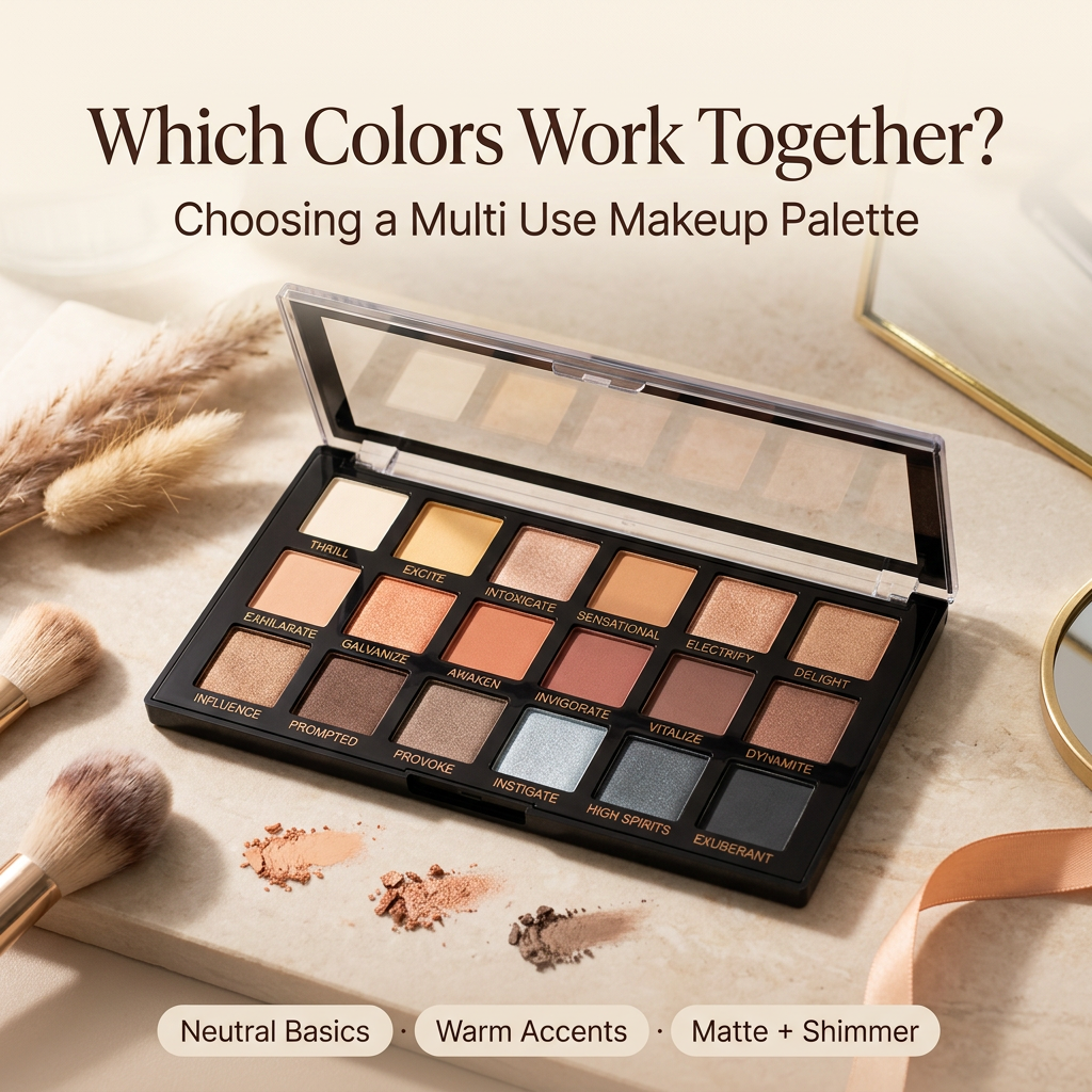
Open nearly any makeup bag and you'll find the same story. A handful of half-used pots, a blush that never quite suits the eyeshadow, and a lipstick bought for one outfit and worn once. A Multi Use Makeup Palette is meant to fix that by putting shades that work together in one place. Whether it succeeds depends less on how many colors are inside and more on how those colors relate to each other.
A good palette feels like a small wardrobe. Some pieces are basics you wear all the time, a few add personality, and everything can be mixed. A bad one feels like a drawer of single-use items.
A versatile combination gives each shade a clear job. Some colors can be worn alone, others blend into new ones, and the overall selection looks like it belongs together. A palette with six near-identical browns may look tidy, yet it limits what a person can create. Variety in depth, undertone, and finish does more for flexibility than quantity.
Start with neutrals. Soft brown, beige, taupe, and nude pink form a dependable base that fits office days, school runs, and weekend errands without looking heavy. Then add a few shades with character, such as peach, coral, plum, berry, or muted rose. These bring warmth or contrast to the base and let the user decide how bold the day should feel.
Depth matters as much as hue. A pale shade brightens, a medium one makes a smooth transition, and a deep one adds definition. A palette with beige, warm brown, and a deeper chocolate gives a user three ways to shape the eye, and each step looks natural beside the others. If every shade sits at the same depth, blending looks flat.
One practical check helps here. Pick any shade in the palette and ask whether it works with at least one other. If a color stands alone with no partner, it will probably sit unused.
Some combinations keep appearing in palettes that people actually finish.
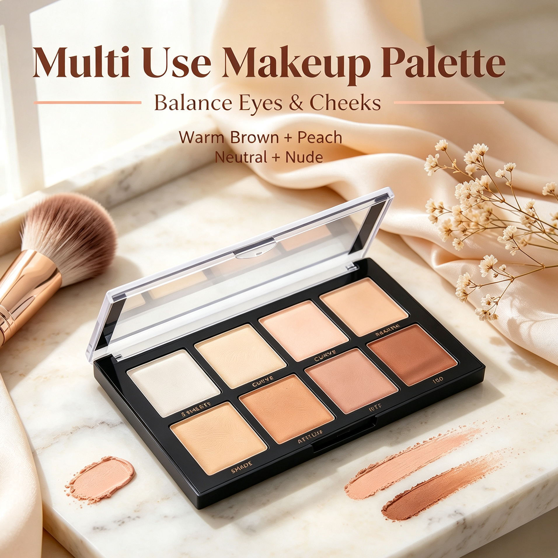
Warm brown and peach. This is a gentle, lively pairing. Brown adds definition, and peach adds warmth, so the face looks awake without looking made-up. It suits workdays and casual meetups, and it works without needing intense pigments. A light beige nearby softens the line between them.
Rose and mauve. These share a family but differ enough to create variety. Rose brightens, and mauve adds a quieter depth. Together they suit the soft, romantic, single-color looks that many people admire in online beauty communities. A user can wear rose for daytime, bring in mauve for evening, and add a berry shade if they want more definition.
Bronze and coral. Bronze brings a warm shine, and coral adds a lively touch. This pairing feels at home in summer and on evenings out. A neutral brown blended between them keeps the transition from looking abrupt, and a champagne shade can lift the look when needed.
Taupe and nude pink. For people who prefer quiet makeup, this pairing is reliable. Taupe gives structure without leaning strongly warm or cool, and nude pink adds a soft flush. Used lightly, they look natural. Built up gradually, they deepen without suddenly changing character.
Plum and soft mauve. Plum adds depth and mauve acts as a bridge to softer rosy shades, so the darker color doesn't feel disconnected. This pairing is useful for evenings, cooler seasons, and more expressive moods. Adding taupe or a muted beige links it back to everyday makeup.
Depth and undertone are different things, and a palette serves more people when it considers both. The same shade can look different depending on skin, lighting, application, and the colors around it.
Warm undertones tend to enjoy peach, coral, bronze, caramel, and warm brown, which create a connected look across eyes and cheeks. Intensity still matters, because a muted peach and a bright coral sit in the same family yet read very differently.
Cool undertones often find rose, mauve, plum, and cool taupe flattering. They give soft contrast without too much warmth. Someone who likes subtle makeup can reach for pale mauve and muted rose, while a berry shade adds more definition when wanted.
Neutral undertones have the widest freedom. A mix of nude pink, soft brown, peach, and mauve gives several directions without committing to one family. For a brand designing a palette for many customers, including a range of shade depths often matters more than adding another trendy color.
The real test of a Multi Use Makeup Palette is how many different faces it can produce in one week.
For an everyday look, begin with a neutral base. Sweep beige or taupe across the lid, blend warm brown near the lash line for definition, and add a touch of peach or nude pink on the cheeks if the product is made for that use. Pair it with a natural lip shade, and the whole face looks coordinated with very little effort.
For a single-color look, choose one family, such as rose, and use it throughout. A lighter version goes around the eyes, a compatible shade on the cheeks, and a related lip color with a slightly different depth or finish. Because the shades aren't identical, the face avoids looking flat.
For a more expressive look, keep a restrained base and add one bold detail. Taupe with plum, bronze with coral, or soft brown with a brighter berry accent all work. Many people enjoy playing with color after a long week, and a palette with a clear base makes that easier because the bold shade has something calm to sit against.
Color gets attention, but texture decides whether a palette is pleasant to use.
Matte shades give definition and smooth transitions. A neutral matte supports natural looks, and a deeper matte builds drama. How well they work depends on the formula, pigment, and blending behavior.
Shimmer finishes catch light and can change how a color looks in different rooms. Champagne, bronze, and soft rose shimmers pair nicely with neutral or warm families. A few reflective shades add interest, while too many make a palette feel busy.
Cream and powder formulas feel different on the skin. Creams blend easily and give a flexible, soft finish, and powders offer a different level of coverage. A shade is only multi-purpose when its formula and safety evaluation support each intended use. A color made for the eyelid shouldn't be promoted for lips or cheeks unless it has been properly developed and assessed for that area. Customers should always read the product's instructions.
Standing in a shop, it's tempting to count shades. A better approach is to look at how they behave. Check the balance between basics and accents. Are there wearable neutrals? Can the colors make both a soft day look and a defined evening look? Do the accents have a partner among the base shades? Is there enough difference in depth?
Try the formula if you can. A color that looks gorgeous in the pan may drag or patch when blended. Notice how it layers and how much pigment appears on the initial swipe. Packaging matters too, since a clear layout and sensible compartments help people find shades quickly in a rushed morning.
Think about the person who will use it. Someone building a daily routine will probably value soft neutrals and wearable rosy tones. Someone who loves creative looks may want deeper colors, reflective finishes, and bolder accents. There is no single correct mix, only a mix that suits its audience.
Brands planning a new Multi Use Makeup Palette have to decide more than shade names. A palette says something about who it is for, and the colors carry that message before anyone reads the label. A soft, rosy selection tells a different story from a deep, expressive one.
Begin with the customer. Picture how she or he does makeup on a normal weekday and on a special evening. Choose neutrals that fit that routine, then pick a small number of accent shades that give the palette a recognizable voice. Test how the colors work together on different skin tones, in daylight and indoor light, and refine the shades until each one earns its spot.
Work with a development partner that can discuss color, formula, finish, and packaging together instead of treating them as separate tasks. Decisions about texture affect how colors look, and packaging affects how easily they can be used. A clear product concept ties these choices to real customers. Sharing your preferred color direction, intended uses, and packaging ideas early helps a manufacturer suggest options that fit your brand, rather than offering a generic catalogue shade set.
Your email address will not be published. Required fields are marked *