English
 Español
 Deutsch
Industry News

(86-579)8507 2566
Welcome to Zhejiang Weiya Cosmetics Co., Ltd.





Welcome to Zhejiang Weiya Cosmetics Co., Ltd.
Sep 16, 2026
A makeup palette may look simple from the outside, but its internal arrangement can genuinely shape how people use it every day. When several colors share one case, the spaces between them become part of the actual user experience rather than a background detail.
Each shade needs to remain easy to identify and access without much fuss during a rushed morning. At the same time, the surrounding areas need enough separation to reduce accidental contact, when fingers, brushes, or applicators move across the palette during application.
This makes compartment design a lot more than a visual choice tucked inside packaging. It connects product arrangement with shade independence, daily handling, cleaning, storage, and the way users manage their palettes over months of regular use.
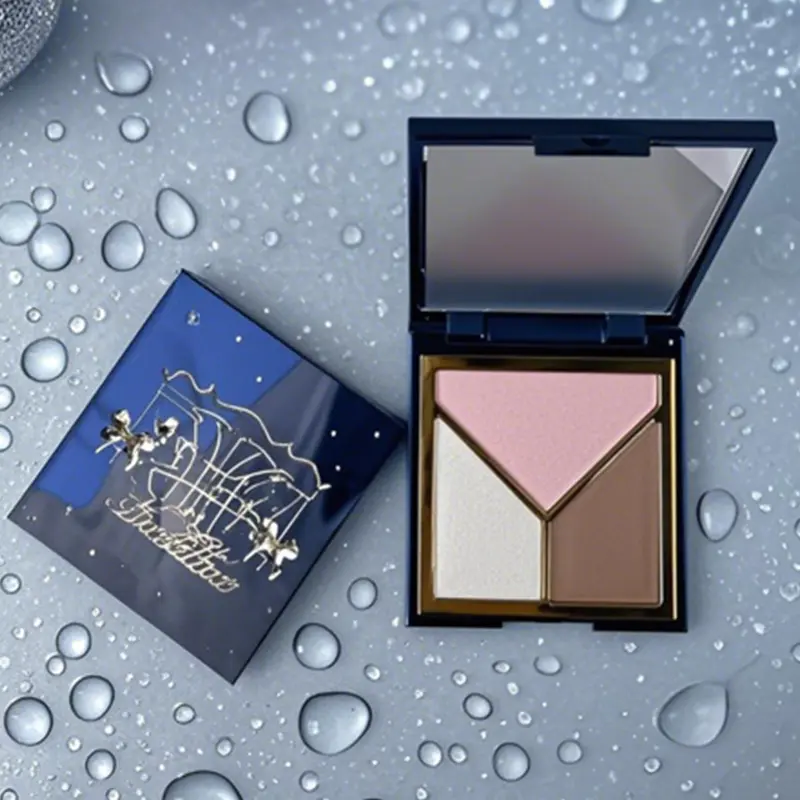
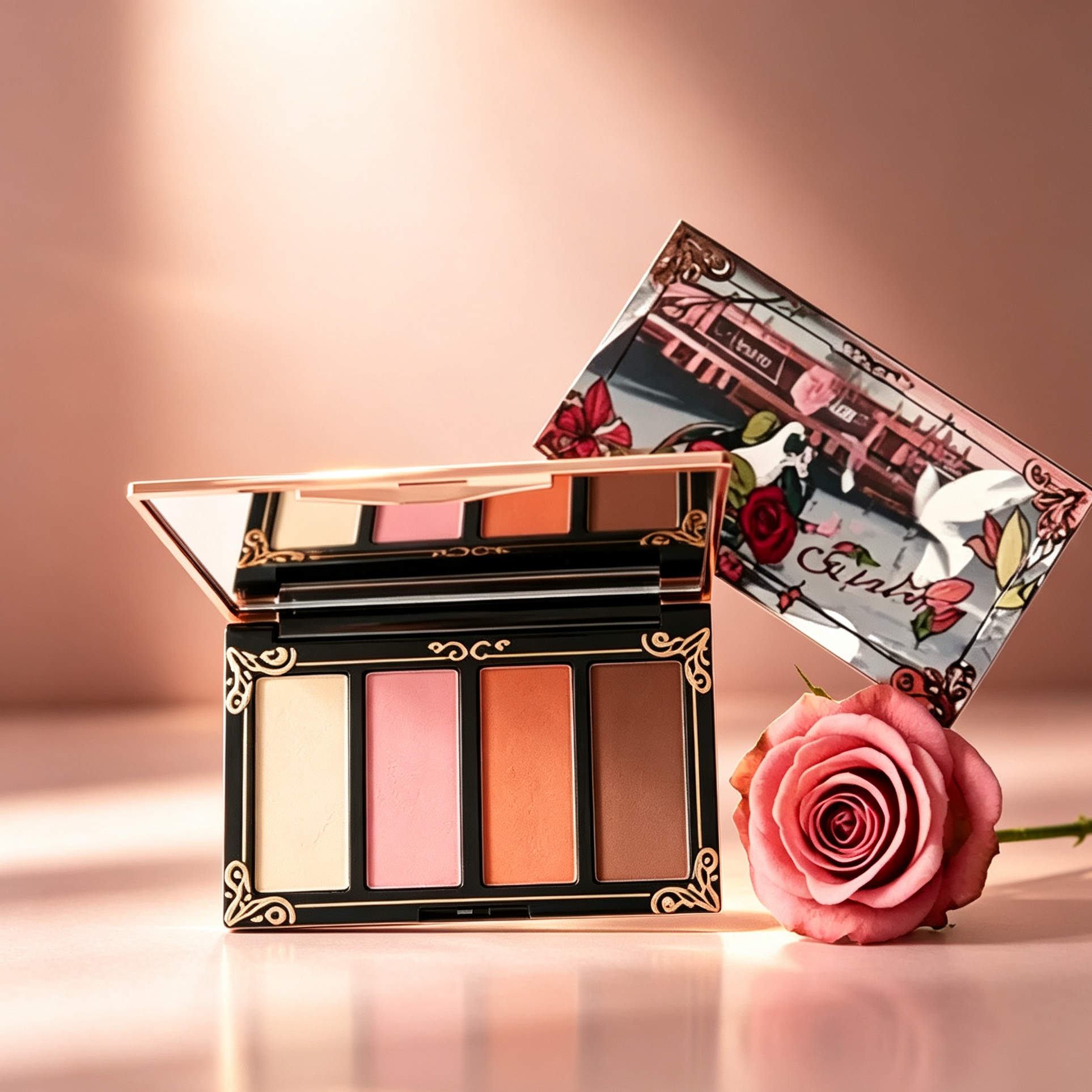
A Cream Makeup Contour Palette may contain several shades that get used together but still need their own defined areas within the case. A Cream Foundation Contour Palette can have a similar requirement, because complexion and contour shades may get selected separately during one single routine.
An All In One Makeup Palette Kit brings another consideration into the mix, because different types of products can share one case entirely. Its internal structure needs to help users understand where each product belongs, without making the palette feel crowded or confusing to navigate.
The internal layout of a palette determines how easily users can recognize and reach individual products without hunting around. Clear sections can make several shades feel like separate products, while still keeping them within one compact package that fits in a bag.
This can be especially useful, when neighboring colors look genuinely similar under normal lighting. Without visible boundaries, users may need to spend more time identifying the shade they actually want before applying anything.
| Compartment Feature | Possible User Experience |
|---|---|
| Defined boundaries | Makes individual shades easier to identify |
| Clear arrangement | Supports familiar daily use |
| Separate product areas | Helps reduce accidental contact |
| Accessible sections | Makes product pickup easier |
| Organized internal space | Helps keep the palette manageable |
Compartment design can also influence how users hold and open the palette during a routine. The location of each section affects where fingers and applicators naturally move as someone reaches in.
The effect becomes more noticeable as the palette gets used repeatedly over weeks. Product traces may appear around the edges, and a clear internal layout can make those areas a lot easier to understand and maintain.
For manufacturers, this means the inside of the case deserves as much attention as the outer appearance people see on a shelf. A visually attractive package still needs an internal arrangement that genuinely works during actual daily use.
Several colors can belong to the same palette without needing to share the same physical space entirely. Separate compartments give each shade a defined location and make the relationship between products a lot easier to understand at a glance.
This separation can be genuinely helpful, when a palette contains colors with different depths or visual roles side by side. A light complexion shade placed beside a deeper contour shade becomes easier to distinguish, when the two areas have clear boundaries between them.
| Separation Method | Practical Role |
|---|---|
| Physical boundaries | Define where each shade begins and ends |
| Spacing between areas | Creates clearer access paths |
| Separate pan shapes | Helps users recognize individual products |
| Grouped sections | Keeps related shades easy to locate |
Independent sections also give users a lot more control when collecting product with a finger or tool. A finger or brush can approach one shade without having to cross through another section entirely.
The purpose here isn't isolating every color completely from its neighbors. Related shades can still appear visually connected, while maintaining enough separation for comfortable handling during a busy routine.
This approach can be genuinely useful for a Cream Makeup Contour Palette, where several colors may get used during the same application session. Users can move between nearby shades while keeping their individual locations clear in their mind.
The internal layout therefore creates a balance between connection and independence within one case. Shades belong to one product, but each one can still have its own working area that feels distinct.
Color transfer is a genuinely practical concern, when several cream products get used close together in the same compact. A brush, sponge, or fingertip can carry traces from one section toward another during normal application throughout the day.
Defined compartment boundaries can help reduce direct contact between neighboring products sitting side by side. They can't eliminate transfer caused by careless handling, but they can make the intended separation a lot easier to maintain over time.
| Potential Situation | Layout Response |
|---|---|
| Applicator moves between shades | Clear sections make boundaries easier to follow |
| Product is picked up near an edge | Defined areas help identify the working space |
| Residue appears around a shade | Separate zones make cleanup more focused |
| Similar colors sit together | Organized placement supports recognition |
This matters, when nearby shades have genuinely different visual characteristics from one another. Even a small amount of another color mixed in may change the appearance of the product being picked up for application.
User habits remain genuinely important as well, alongside the physical design itself. Taking product carefully and keeping applicators reasonably clean can help maintain the separation that the package was built to provide.
Compartment design and user behavior therefore work together rather than functioning independently. The package provides a physical structure, while everyday handling determines how well that structure actually gets maintained.
For a Cream Foundation Contour Palette, this can prove useful, when foundation-related colors sit near contour shades in the same compact. Keeping those areas visually distinct can make the palette a lot easier to manage during repeated daily use.
A palette is essentially a small workspace that people return to every day. Users need to move between products, remember where colors are located, and reach each area without unnecessary fumbling around.
Arrangement can create a genuinely natural visual order within the case. Shades that are commonly used together can get placed near one another, while products with different purposes can occupy separate sections entirely.
| Arrangement Choice | User Consideration |
|---|---|
| Related colors together | Makes shade relationships easier to understand |
| Separate product groups | Helps distinguish different categories |
| Clear visual order | Supports quick product recognition |
| Balanced spacing | Reduces the feeling of crowding |
| Familiar placement | Makes repeated use more natural |
There's no single arrangement that suits every palette on the market. Some designs may use rows, grouped areas, or other layouts, depending on the number and type of products included in the case.
A familiar arrangement can genuinely become part of a user's routine over time without much conscious thought. After repeated use, people may reach toward a particular section automatically, because they remember its position from muscle memory.
This is especially relevant, when the palette gets used frequently throughout a normal week. The less time users spend searching for a product, the more naturally the package can fit into their actual routine.
An All In One Makeup Palette Kit may require additional grouping, because it can contain several product categories within one case at once. Clear internal zones can help users understand the product, without needing to inspect every single compartment before starting.
Different shades don't always need identical spaces carved out for them. Their expected use, application area, and handling method can influence how much room genuinely feels practical for that particular color.
A frequently accessed shade may need enough surrounding space for easy pickup during a quick morning routine. A shade used more selectively may occupy a smaller section while still remaining easy to reach when needed.
| Compartment Approach | Possible Purpose |
|---|---|
| Larger section | Provides more working room |
| Smaller section | Keeps selected products compact |
| Similar section sizes | Creates a consistent internal layout |
| Varied section sizes | Reflects differences between products |
The visual balance of the palette also changes, when compartment sizes vary from section to section. Consistent sections can create a genuinely regular appearance, while varied sections can show that different products have different roles to play.
Manufacturers can consider expected usage when deciding how products should get distributed inside the case. Equal space isn't always necessary, if the products themselves have genuinely different handling needs from one another.
A Cream Foundation Contour Palette, for example, may contain complexion colors that require broader access and contour shades applied in more focused areas. The internal layout can acknowledge those differences, without making the palette difficult to understand at first glance.
Compartment size also affects cleaning quite a bit down the line. If several areas are packed too closely together, removing product residue around one section can become genuinely less convenient to manage.
Cream products can leave traces around their sections during repeated use over weeks. These traces may collect near edges or on the surrounding surface, when users pick up product with fingers or tools throughout the day.
Separate compartments can make cleaning genuinely more manageable, because each area has a recognizable boundary to work within. Users can focus on one section, rather than wiping across several shades at the same time and risking mixing them.
| Cleaning Area | Design Consideration |
|---|---|
| Product edges | Should remain reasonably accessible |
| Compartment boundaries | Help separate cleaning areas |
| Surrounding surface | Provides room for wiping |
| Internal corners | Should be practical to maintain |
The shape of the compartment can also affect access to small areas tucked into corners. Simple internal surfaces may be a lot easier to reach than layouts with unnecessary spaces that collect residue over time.
Cleaning is also genuinely connected with shade separation throughout the case. When users can clearly identify where one product ends, they can avoid spreading residue into neighboring sections during a quick wipe-down.
This can help preserve the organized appearance of the palette throughout regular use over months. It also gives users a genuinely clearer way to inspect which areas need attention before they become a problem.
For manufacturers, cleaning considerations can get included during package development, rather than treated as an afterthought tacked on later. The internal structure can support routine care through straightforward access and visible product boundaries throughout the case.
An All In One Makeup Palette Kit can bring several product categories into one single package. This creates a genuinely different internal planning challenge from a palette containing only closely related shades.
Users may move between complexion products, contour colors, and other included items within the same compact. If the sections are visually too similar, the user may have to spend a lot more time identifying each product before starting their routine.
| Product Group | Arrangement Consideration |
|---|---|
| Complexion products | Keep access straightforward |
| Contour colors | Provide clear shade separation |
| Smaller products | Keep compact sections easy to reach |
| Frequently paired products | Place within a convenient relationship |
Clear grouping can make the internal structure a lot easier to understand at a glance. Related products can share a section of the layout, while different categories can have noticeable separation from one another.
The outer case can remain compact, while the interior still creates a genuine sense of order for the user. This is part of what makes an all-in-one format practical for people who want several products within one single package.
The internal structure can also help users remember product locations over time without much effort. Once the arrangement becomes familiar, the palette can get opened and used without repeatedly searching through every section like it's the first day.
This shows why an all-in-one palette isn't simply several products placed together at random. The relationship between compartments genuinely influences how users understand and manage the complete product as a whole.
A Cream Makeup Contour Palette may contain several related shades that need to remain visually distinct from one another. Clear product zones can help users understand the position of each color, without making the palette feel disconnected or scattered.
A lighter shade, a medium shade, and a deeper contour color may all have genuinely different places within the user's daily routine. Keeping those areas separate can make it a lot easier to move between them without confusing one shade with another mid-application.
| Product Zone | Possible Design Role |
|---|---|
| Light shade section | Supports quick recognition |
| Medium shade section | Provides an identifiable transition area |
| Deeper shade section | Keeps stronger colors visually separate |
| Shared surrounding area | Supports movement between selected shades |
The layout can also support different personal habits across different users. One user may repeatedly reach for a lighter color, while another may use a deeper shade a lot more often depending on the day.
A useful layout doesn't need to force users into one rigid application order. It can simply give every color a clear location and allow the user to develop a preferred routine that suits them.
This makes product zoning part of everyday interaction rather than a hidden design detail. After repeated use, consumers can become genuinely familiar with the position of each shade and manage the palette with a lot less searching around.
For manufacturers, this also creates an opportunity to think about how the palette looks during its entire period of use, not just on day one. The arrangement should remain understandable even when some areas show more signs of use than others.
A Cream Foundation Contour Palette can bring complexion and contour products into one internal structure. Because these products may get handled quite differently, their compartments can help establish clear boundaries between them from the start.
Foundation-related shades may get accessed across a broader area during application. Contour shades can get selected in smaller amounts, so giving these products recognizable sections can make the user's movement between them a lot easier to control.
| Management Activity | Compartment Contribution |
|---|---|
| Shade identification | Creates recognizable locations |
| Product inspection | Makes individual areas easier to check |
| Cleaning | Keeps attention on specific sections |
| Daily storage | Maintains a familiar internal order |
| Repeated use | Helps users remember product positions |
Palette management also involves checking product condition and remaining contents from time to time. When every shade has its own defined area, users can quickly see which sections receive regular attention and which don't.
This familiarity can become genuinely useful as the palette ages over months of daily use. Even when some sections become more used than others, the basic arrangement remains stable and easy to navigate.
The internal design therefore supports a lot more than just the moment of application itself. It also affects how users store, clean, inspect, and handle the product throughout its entire period of use.
Compartment design brings several product decisions into one small space that gets used daily. Manufacturers need to consider shade separation, access, internal arrangement, cleaning, product relationships, and the way consumers are genuinely likely to handle the palette.
A useful approach is thinking about the palette as an organized working surface, rather than simply a container holding color. Each section should have a genuinely clear purpose, while the relationship between neighboring sections should remain easy to understand.
| Design Question | Why It Matters |
|---|---|
| Where should each shade sit? | Supports product recognition |
| How should colors be separated? | Helps maintain individual product areas |
| How much space should each section have? | Affects access and handling |
| How should different categories be grouped? | Makes the palette easier to navigate |
| Can users clean the internal areas easily? | Supports ongoing palette management |
| Will the layout remain understandable during use? | Helps maintain familiarity over time |
Product arrangement can also get considered alongside the expected consumer routine before finalizing a design. A palette intended for repeated daily use may need a genuinely different internal relationship from one designed around occasional color changes.
The same principle applies to an All In One Makeup Palette Kit, where the number of product categories can make internal organization even more important to get right. Clear compartments allow variety, without requiring every product to occupy the same type of space regardless of purpose.
A Cream Makeup Contour Palette can use separation to keep related colors recognizable throughout daily use. A Cream Foundation Contour Palette can use product zones to distinguish complexion and contour areas from one another, and the result is an internal structure that connects product independence with access, cleanliness, organization, and everyday palette management.
Your email address will not be published. Required fields are marked *